 This picture was taken in London, England. This is in front of the Japanese Embassy, and the black void in the picture is a stoplight.

Monday, December 20, 2010
Photography: Stoplight
This picture was taken in London, England. This is in front of the Japanese Embassy, and the black void in the picture is a stoplight.
Classical
 This is my last concentration piece. I did a still life of a wine bottle, glass, and grapes. The objects are drawn with white and black charcoal. I of course made the background with using found papers, in a collage. Then I did an acrylic pain wash on top, and then dabbed red paint on top of that to give the more textured look. I am proud of this piece but in the next one I would like to show more development.
Saturday, December 11, 2010
Flower
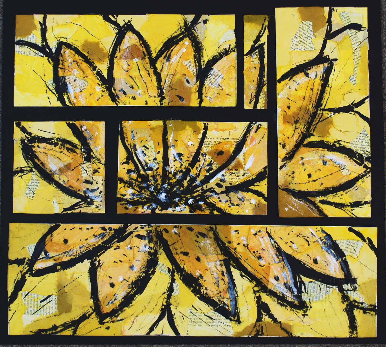 This was my first attempt at a polyptych, I used my unique style of creating the background by using found papers and then doing a color wash on top. I used india ink in this piece to draw the flower. I used a stick dipped in the india ink to draw with. I then went in with white acrylic paint to add some contrast and highlights. I like this piece, it reflects my happy personality. I enjoyed making this a polyptych piece, i think it adds interest.
Saturday, December 4, 2010
Geometric Weave
 This was my first independent project. I had done the weaving technique in an earlier project. I absolutely hated that first woven piece and so i wanted to give it one more chance. I like this woven piece a lot. I like that there is the small woven rectangle on top of the woven circle in order to provide a focal point. This is not something that I would consider being part of my concentration. I did enjoy making this piece though.
Behind the Scenes
 This piece was supposed to display quick motion, almost a sketchy quality to the piece. This was drawn on a collage background and then gesso was applied to the background so that there would be a good foundation for drawing. This is a still life behind the stage in the auditorium of my high school. These are the lights and electrical components for the stage. The red was added to create contrast and interest in the picture. Not one of my favorites but I like the sketchy quality in this piece.
The Last Leaf
 This piece was supposed to be based off of an altered book that I did. I like this piece because it is an example of my style. This was the first time I did a color wash on top of my collage background. The tree and leaf was drawn by using charcoal. I added magazine in order to create contrast (white magazine). It is hard to see but there is also rolled up black magazine paper on the tree in order to give it a three-dimensional look. I really like this piece!
Thursday, September 30, 2010
Distorted Me
 The process for this piece was taking a picture of me, distorting it using photoshop and then transferring the image to a piece of masonite. I then took soft pastels and shaded the face and came up with the background color. Other mediums used was charcoal and india ink to give more emphasis in the picture. I think that this is a good piece, but it is not one of my favorites. I feel that maybe a different medium could have helped this project out. This is also not my style and was a huge risk for me as an artist. I am proud for following through with this project, but i think i am going to have to let it grow on me.
Subscribe to:
Posts (Atom)