

Monday, December 20, 2010
Photography: Stoplight
 This picture was taken in London, England. This is in front of the Japanese Embassy, and the black void in the picture is a stoplight.
Classical
 This is my last concentration piece. I did a still life of a wine bottle, glass, and grapes. The objects are drawn with white and black charcoal. I of course made the background with using found papers, in a collage. Then I did an acrylic pain wash on top, and then dabbed red paint on top of that to give the more textured look. I am proud of this piece but in the next one I would like to show more development.
Saturday, December 11, 2010
Flower
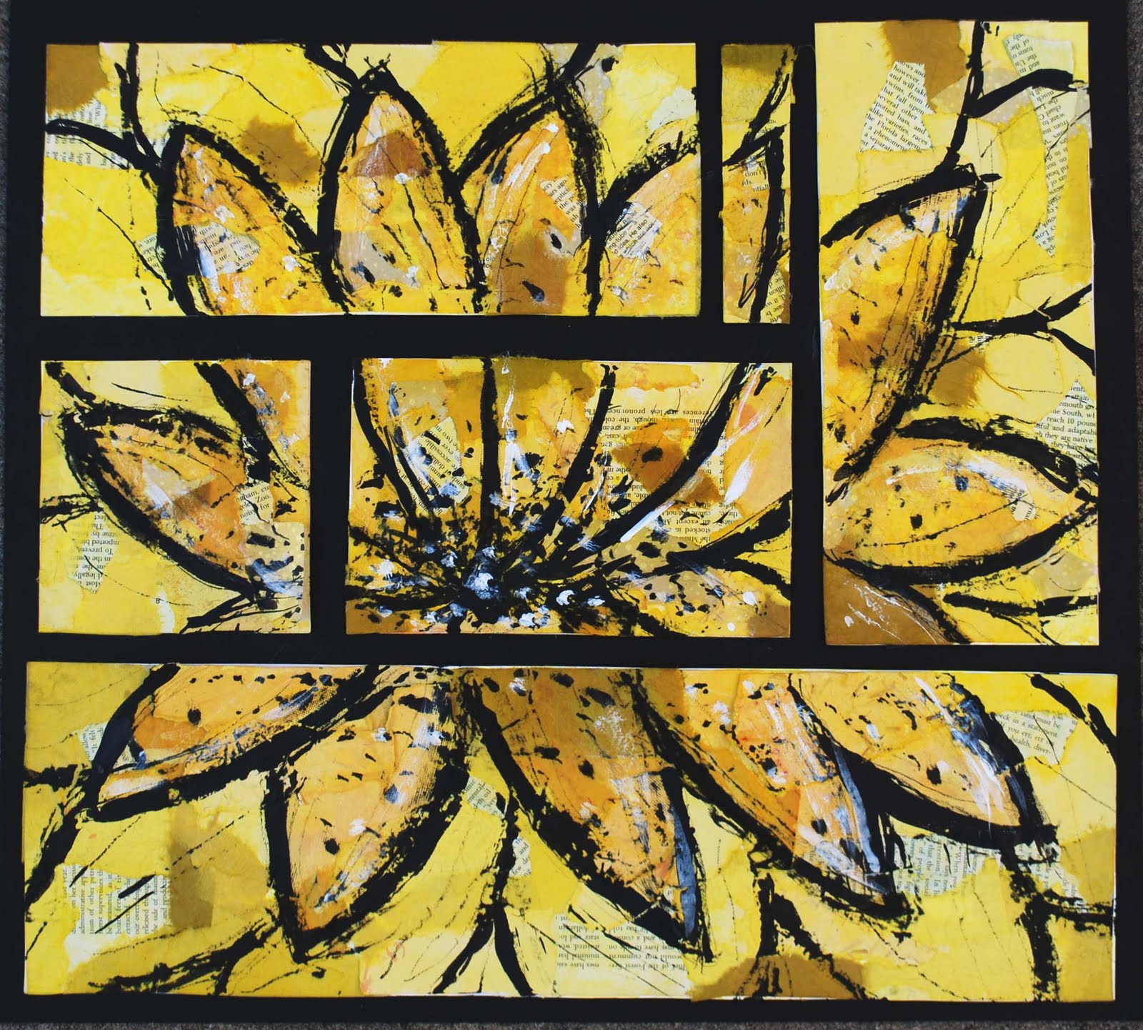 This was my first attempt at a polyptych, I used my unique style of creating the background by using found papers and then doing a color wash on top. I used india ink in this piece to draw the flower. I used a stick dipped in the india ink to draw with. I then went in with white acrylic paint to add some contrast and highlights. I like this piece, it reflects my happy personality. I enjoyed making this a polyptych piece, i think it adds interest.
Saturday, December 4, 2010
Geometric Weave
 This was my first independent project. I had done the weaving technique in an earlier project. I absolutely hated that first woven piece and so i wanted to give it one more chance. I like this woven piece a lot. I like that there is the small woven rectangle on top of the woven circle in order to provide a focal point. This is not something that I would consider being part of my concentration. I did enjoy making this piece though.
Behind the Scenes
 This piece was supposed to display quick motion, almost a sketchy quality to the piece. This was drawn on a collage background and then gesso was applied to the background so that there would be a good foundation for drawing. This is a still life behind the stage in the auditorium of my high school. These are the lights and electrical components for the stage. The red was added to create contrast and interest in the picture. Not one of my favorites but I like the sketchy quality in this piece.
The Last Leaf
 This piece was supposed to be based off of an altered book that I did. I like this piece because it is an example of my style. This was the first time I did a color wash on top of my collage background. The tree and leaf was drawn by using charcoal. I added magazine in order to create contrast (white magazine). It is hard to see but there is also rolled up black magazine paper on the tree in order to give it a three-dimensional look. I really like this piece!
Thursday, September 30, 2010
Distorted Me
 The process for this piece was taking a picture of me, distorting it using photoshop and then transferring the image to a piece of masonite. I then took soft pastels and shaded the face and came up with the background color. Other mediums used was charcoal and india ink to give more emphasis in the picture. I think that this is a good piece, but it is not one of my favorites. I feel that maybe a different medium could have helped this project out. This is also not my style and was a huge risk for me as an artist. I am proud for following through with this project, but i think i am going to have to let it grow on me.
Wednesday, September 29, 2010
Sticks & Mini Guitars
 This piece was created by drawing with a stick that was sharpened and then dipped into india ink. The purpose of this piece was to show the sketchy look and draw as quickly as possible. I really liked this project and since this project I have drawn with sticks a couple of times. I think that this piece was successful and I like how the guitar is emphasized by the use of red and yellow. This was a really fun piece for me. :)
Friday, September 3, 2010
Dress up

This was my second summer assignment. This is a charcoal drawing of a shoe and pearls on a mixed paper background. It is hard to see the background but thats one of my favorite parts. I used alot of different textured, yellow paper and by doing this it made the drawing more interesting!
Coliseum

This was my first summer assignment. This summer I took a vacation to Europe and I actually got to see the Coliseum in Rome. This painting was based off of a photo I took when I was in Rome. I like how this piece turned out. One downfall to this piece is its size. This painting is very small. I like the monochromatic theme that is portrayed in this painting. Overall I am proud of this piece.
Thursday, September 2, 2010
Blue Jars

This is a charcoal drawing on black paper. I used white charcoal instead of using common black charcoal to shade these jars. The blue was added to create harmony and emphasis in the piece. I like the way this turned out but I think something could be improved on in this piece. This was a unique piece because as a class we were experimenting with the erasure technique. We did this to try to show movement in the piece. For example, the lid opening on the bigger jar. I'm not a huge fan of this technique but i gave it a try.
Wednesday, September 1, 2010
Weight

This is one of my pieces from last year. I like this piece because of the monochromatic color scheme. I also like the fact that i took what seems to be a masculine object such as a weight and used a more feminine color to paint it with. I like this piece.
Saturday, August 21, 2010
I am Art.
So, I was sitting in my living room thinking about why art is so important to me. I had just finished looking at the different art blogs that my classmates have created. I was inspecting all of the different styles of art that we all find to be near and dear to our heart. I then got to thinking... Why is art important to me? I of course went to the immediate cliche answers of, it allows me to be creative, it's just cool to be able to create something original, it's therapeutic, and so on. But as I really took a look inside I realized its not just about creating something original or being creative. For me it's about discovering what I am capable of doing as a person. What I can challenge myself to do. What I am willing to show the world about myself. For me creating something is empowering. Nobody else can create what I can. Each time I finish a piece of art I am putting a piece of me out there to be critiqued and judged. This brings up the question will people like what they see? I believe art is more than something just cool to look at. It is a part of that artist, it is their hard work, patience, problem solving, their story. I am not sure I have answered the question of why art is so important to me, but I do know that as long as I am capable of doing so, I will create and continue to put little pieces of me out into the world to be judged and hopefully to be appreciated.
Wednesday, May 19, 2010
Pearls

This piece is a still life on mixed papers. The still life was drawn using charcoal. This is one of my favorite pieces that I have completed this year. I have never been great at portraying values, however this piece really turned out well. I love that this looks realistic. This was just a successful project over all. I liked how we went back to the basics of drawing but put a new twist on it. By far one of my favorites!
Wednesday, April 28, 2010
Alcatraz

This is my favorite piece of the year. This was also one of the most difficult pieces to complete. Precisionism is harder than it looks. I do like the color scheme in this though. One of my favorite pieces this year.
Monday, March 22, 2010
This Is Me

This piece took alot of patience. My image transfers seemed to be giving me a really hard time. I love how this turned out. I think that the image was really good. This has been my favorite project so far. It felt like the only thing that was to be accomplished in this piece was to be creative and have fun. I really like this artwork.
Patterned People

These are my figure drawings with a peter max inspired theme. I really like how this piece turned out. I think that it is really colorful and enjoyed coming up with different patterns. One of my favorite things about this is how the gray background pulls all of the figures together. It brings unity to the piece.
Wednesday, March 17, 2010

Running Girl

This was the first project that we did in Art III . This is an illustration for a story that an elementary school student wrote.
Wednesday, February 10, 2010
First Altered Book Page

This is my first Altered Book Page. I really like this design. I wanted to bring all of the different colors together and i think that worked out pretty well for me.
Subscribe to:
Posts (Atom)